-min.png)


.svg)


Raiseway Case: How We Gave a Complete Makeover to a Platform That Simplifies Crowdfunding
cases
30/5/2023
Let us introduce you to Raiseway. It's a platform that helps small businesses access crowdfunding. They guide entrepreneurs through the process and provide everything they need to make it happen.
Formerly, Raiseway struggled to attract clients with its past identity. Together, we transformed their brand identity, website, and communication to ensure they connected all the gaps and increased brand awareness.
Research time
Angelina, Operations Lead at Bolder:
"First, we delved into extensive research and uncovered the primary challenges that business owners encounter in their day-to-day routines:
1. Small business owners face the daunting task of juggling multiple responsibilities, which can be incredibly challenging.
2. While crowdfunding may initially appear simple, entrepreneurs quickly realize that it demands expertise in marketing, legal knowledge, and accurate financial projections to achieve success.
3. Existing solutions often lack engagement; warm and friendly interaction, failing to make business owners feel valued and competent, adding to their existing anxiety and stress levels."
So, what clues have we found for Raiseway communication? Raiseway should use a friendly tone in order to foster a welcoming environment for businesses. They should explain the crowdfunding process clearly and confidently, setting realistic campaign expectations and empowering business owners on their funding journey.

New communication style
Hanna, Creative Writer at Bolder:
"Raiseway stands out with their new communication style. It takes on multiple roles simultaneously, providing practical assistance, understanding their audience's needs, and fostering a relatable and trustworthy relationship with their customers:
1. Dedicated friend and guide: Raiseway positions themselves as a reliable companion, guiding customers throughout their crowdfunding journey
2. Bridging the gap: Raiseway understands and listens to the concerns, challenges, and aspirations of small businesses and entrepreneurs, bridging the gap between the platform and its target audience
3. Practical yet relatable: Raiseway provides tailored support, empowering their audience to confidently pursue crowdfunding campaigns with relatable and trustworthy communication"
Turning insights into visual concepts
Polli, Middle Graphic Designer at Bolder:
"The previous visual identity of Raiseway failed to capture their mission. Analyzing the crowdfunding platform's visuals, we found better solutions:
1. Lack of warmth and appeal > New visuals should make you feel at home and excited about the crowdfunding journey
2. Dull colours failed to grab attention > Vibrant hues are needed to catch the eye and convey the celebratory energy of Raiseway
3. Overall complexity > Simplicity is key: Raiseway needs intuitive design elements"
Cooking new visuals
Alla, Senior Graphic Designer at Bolder:
"We created an identity that embodies the excitement of the crowdfunding journey, using vibrant hues and intuitive design elements. It celebrates successful small business owners who raise funds through crowdfunding
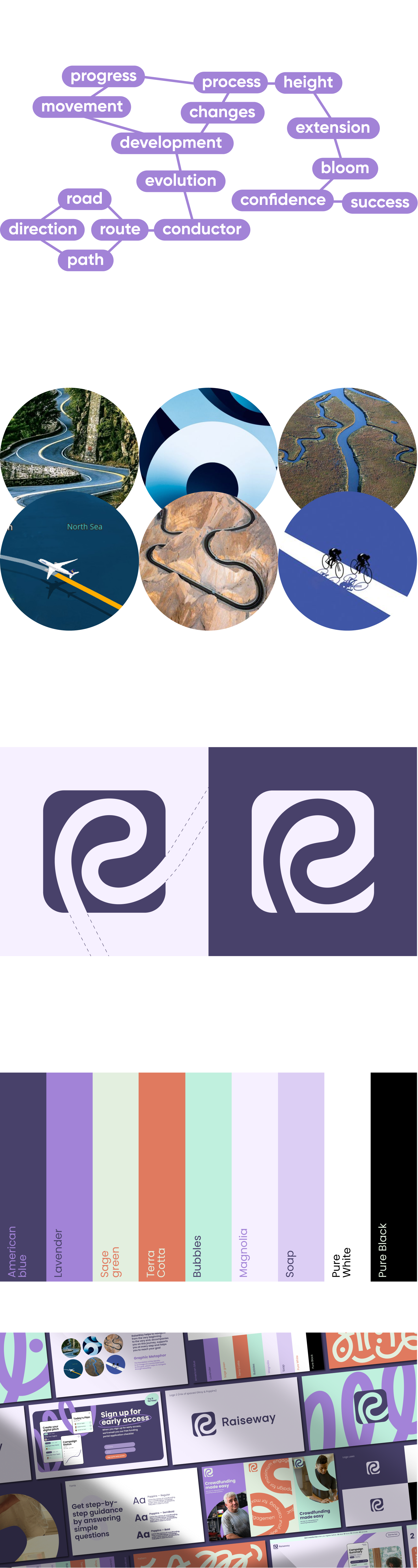
1. Design semantics
To understand Raiseway better, we went on a learning adventure. Guided by an association tree, we delved into the project's essence to discover the optimal direction for future design. Along the way, we came across entities such as path, direction, guide, progress, and success
2. Moodboard
We drew some inspiration to create bright, inviting, and relatable designs, incorporating simple shapes and standout information blocks
3. Graphic Metaphors
Raiseway's visual identity centers around a comfortable path to success, symbolizing their guidance and support throughout businesses' crowdfunding adventures. They're with you every step of the way
4. Fresh logo
Raiseway's new logo is shaped like the letter "R" and symbolizes a neat journey to success. It walks you through your personal crowdfunding journey.
5. Brand Pattern
See the small shapes in the core elements of the new visual identity. They convey a joyful energy, reflecting the excitement and triumph businesses experience when successfully raising funds through crowdfunding campaigns.
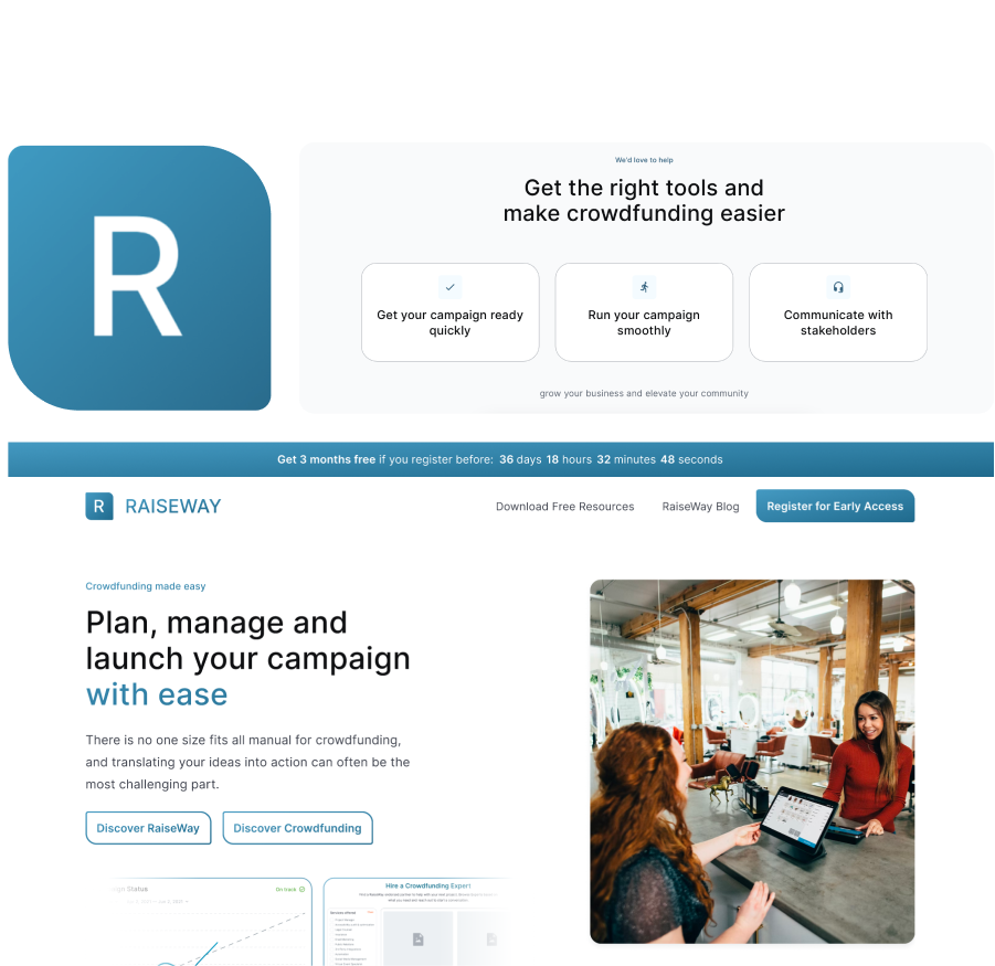
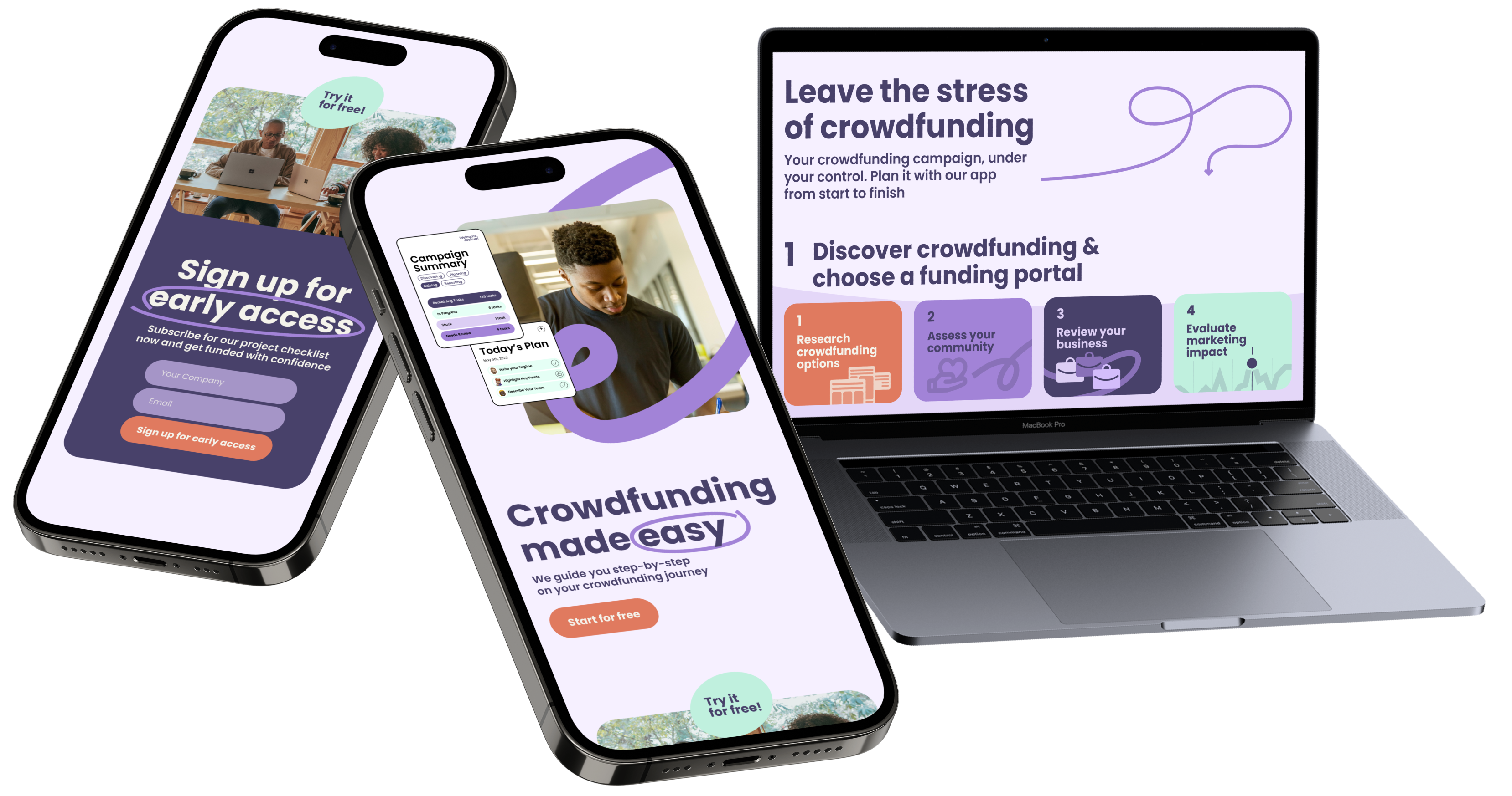
6. Landing page layout
We developed a relatable storytelling approach that not only resonates with business owners but also simplifies the complex process that all crowdfunding allies go through."
Celebrating with Raiseway
Our clients' happiness brings us joy. Take a look at the feedback from
Peter Rostovsky, Co-Founder and CEO of Raiseway, about his experience with Bolder:
“Bolder is great to work with; we will work with them again. We are deeply grateful for their work in teasing out our - sometimes vague - ideas for how to formulate what we do and how to display it in our brand assets and on our website landing page. The amount of work done on each item is remarkable - we showed their drafts consistently throughout the process to our partners; everyone is impressed.”
Access full review via Clutch
Liked this case? Stay tuned for more. Join us in supporting innovative companies dedicated to making a positive social impact, much like Raiseway. Reach out to us now to explore your project together!

